[New Users] Please note that all new users need to be approved before posting. This process can take up to 24 hours. Thank you for your patience.
Check out the v.266 - The Sengoku Warrior Reawakening patch notes
here!
New Masteria Map Lookin Good, Good Job Nexon


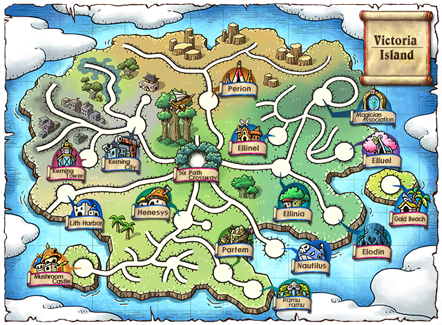
Compared to the re-done of Vic Island, the new Masteria map has more detail and a more appealing placement of colors. Like the roads being in color instead of white, or the color themselves being more saturated and less washed out. There is literally more crosshatching on the clouds - very nice. The landmarks being represented in the map is better as well, but considering there are a lot of places in Vic Island now, I won't harp out on it.
As an aside, I haven't actually done the new content yet, but I thought I'd share some actual positivity. It seems the new equips were given some thought into the current meta is something which I also appreciate - something unique in the game to progress over.
The new bosses look amazing too, props to the design team. Really imaginative and stylish, the art team always doing a quality job, as well as the guys who do the music, but that's always a given. It looks to be especially nice for this one. Not a fan of the daily part since that is old hat to me now, and makes me unsure of CWKPQ's fate, but we'll get there when we get there.


Comments
It looks like this map was done by a different art team, on the overall better.
Hopefully Nexon has actually given players what they want and this content won't fall into obscurity. (Again)